Showing posts with label julie beck. Show all posts

Wednesday, July 21, 2010

Completed Painting: I Want To Run Away and Join the Office

This painting was a lot harder than I thought it was going to be. The wood grain, the color or the stapler... it was all very difficult. It took me 3 or 4 times just to get the stapler color. But here we are... done. The original reference photo for this was done by SugarPush on Etsy... her products and photos are beautiful!

you can see a couple stages of this painting here:
Stage 1
and here:
Stage 3

I didn't happen to take any progress shots in between because frankly... I forgot. Whoops! In the end, I'm not 100% happy with it, but I need to move on. Hope you enjoy it!

I Want to Run Away and Join the Office.


Also, as usual, the title comes from a great Mike Doughty song called American Car.

Wednesday, July 14, 2010

Photoshop Tutorial for product shots

This is a parallel post in response to Made In Lowell's photo editing post (view her tutorial here). I suggested that she try adjustment layers and masks to do the same thing. There's no "right" way to do anything... but when I learned some of these techniques, it streamlined my process.

The first steps are great advice. Here is her first step

Step 1. An online shop is only as effective as its photographs. Good product photography will always be your best marketing tool. I don't have a fancy camera, I use an older model Kodak Easyshare, so I try to make my photos shine with Photoshop. I'm using an older version of PS, CS3. This information will be most helpful to you if you have at least a little experience using Photoshop.

I have a shelf near a window where I put down some white paper and capture the natural light on my subject, which today is a little felted wool pincushion. I set up an object to be in the background and give the photo some depth, in this case a stack of folded linen fabric.
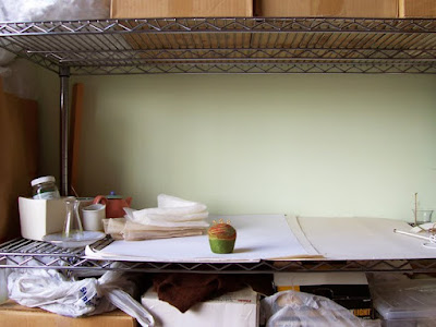


I take a bunch of shots from slightly different angles keeping in mind my final composition will be square. I try not to take 30 shots because I don't want to have to sort through 30 pictures later, I will probably take 5-10. Here's the one I'll edit today:
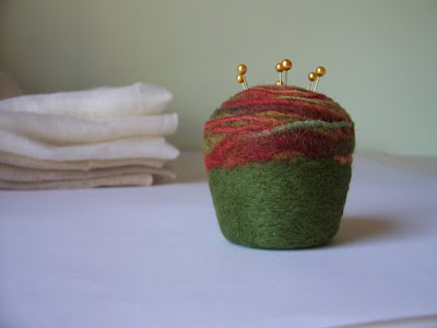

I open the picture in Photoshop and use the crop tool to make my favorite size for Etsy listings, 8 inches x 8 inches at 125 DPI. This makes it so when my customer clicks on the picture it will become larger and give them a chance to take a good, close look while the picture remains within Etsy's size parameters.
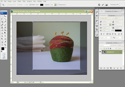
This is the point where I veer off in another direction.

Step 2. Adjustment layers are great because you can make adjustments, to brightness/contrast, levels, curves, etc... all without destroying the original image. These adjustment layers can be layered one on top of the other. Each adjustment layer affects all the layers below it as if everything below it was one image.... all while retaining all your layers.

The first adjustment layer I use is Curves. I was once told that curves is better than levels and brightness/contrast combined. You can find curves at the bottom of your layers pane. it looks like a moon cookie - half black half white.
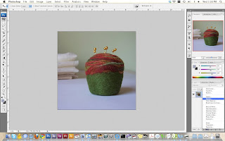
You'll see when the Curves window pops up that there are 3 eyedroppers. One dark one middle and one white. Pick the white eyedropper. And then click on an area of the photo that should be pure white.

This is how you can tell photoshop what area should be white. Photoshop will automatically do the work. This works on 99% of the photos you will be adjusting. The only time this does not work is when you have a largely white photo with lots of shades of white or it's monochromatic.
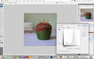
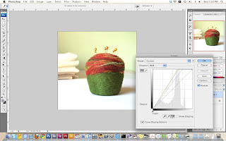
Press Ok and you'll notice it creates it's own layer above your photo.

Step 3. (you can skip to Step 4 if you're happy with your image after this) Next, because I'm trying to match her photo, I am going to add another adjustment curves layer (you can add as many as you want!) Once again, the curves window will pop up.
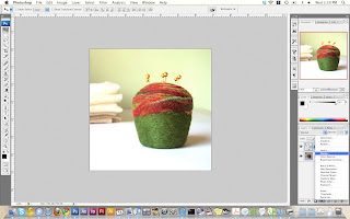
At the top of the window is a drop down menu. This gives you preset options. I use "lighten" a lot. Don't be afraid to try some of the other presets to see if you like the results... remember, it's not changing your original photo!
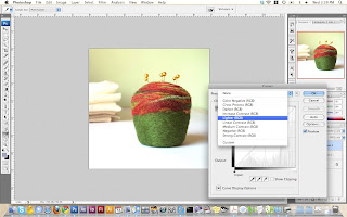
Once you click lighten, you'll see a difference. You can change the graph manually if it's not perfect. This is a graph of the dark to light interpretation of your image. By default it's a straight line.

Pull the middle of the graph up... too light.
Pull the graph down, too dark.
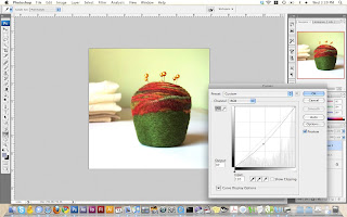
The preset was just fine. So I used the preset of Lighten and clicked OK. We now have 2 adjustment layers.
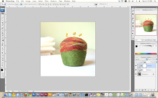
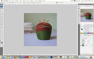
You can hide the two layers and you will see your original layer. (to hide a layer, click on the eyeball on that layer).
Step 4. To create the depth of field in her image I use a similar process. Duplicate the original layer.
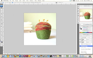
Apply a Gaussian blur to this new layer which is on top of your old layer. Notice this is all underneath your adjustment layers, so it still looks all purdy!
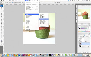
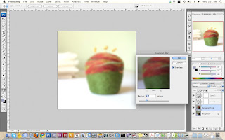
Step 5. This is where Liz uses the eraser tool. Personally, I don't like the eraser tool is because it's "destructive" meaning it modified the actual image and may be hard to get it back if you don't have enough levels of undo.

This is where MASKS come in. To work with masks you just have to know this:
WHITE means fully opaque.
BLACK means fully transparent
SHADES OF GREY are in between the two.

Apply a mask to your fuzzy layer. Make sure you're clicked on your fuzzy layer and hit the mask button. The mask button is in your layers toolbar, right next to the adjustment layer button. It looks like a circle inside a rectangle.
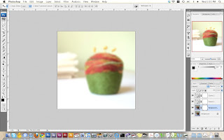
You'll notice it adds a fully white box onto the layer. This white box is your mask for that layer. that means the entire image is fully transparent. Fully white=fully transparent.
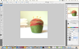
Next click on the paintbrush tool. NOT the eraser. The paintbrush tool. Make sure your paintbrush is going to paint BLACK. I like to use a paintbrush with soft edges (0% hardness) so it's not so obvious where the edges of my brush are.
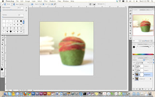
Since your layer under the fuzzy layer is "in focus" you want the closer thing (the pin cushion) to show through. This means you want to remove the fuzzy picture wherever the pincushion is. PAINT BLACKNESS where the pin cushion is.

Notice below, you can see in my layers pane, there is a big black splotch where the pin cushion is. This means I am technically erasing away the fuzzy photo the same way the eraser does. EXCEPT!! If you paint WHITE back in.... VOILA, your fuzzy picture returns.

Masks allow you to erase without actually deleting information.

Here I zoomed in so I can get up close to the edges without removing too much.
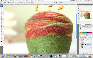
Basically, masks are things that tell photoshop what you want to be transparent versus opaque. Use shades of grey and you'll have semi transparent areas (nice for edges where there isn't a defined edge, like hair!) Masks can be deleted too, so you're not stuck with it.
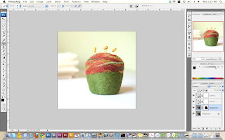
At this point you can be done. File>Save (save photoshop file if you may want to make more changes later) and the File>Save As>Jpeg But since I am trying to mimic Lizs photo I want to make one more tweak.

Step 6. You'll notice now that your adjustment layers automatically have masks. Below I added another adjustment layer called photo filter. Photo Filter is nice to add a slight hue to your photo without it being crazy. I wanted to add a little yellow to the pin cushion but NOT the rest of the photo. I added the adj. layer, and then painted black all around the pin cushion. Now the only place this adjustment layer will change anything is where the mask is white.
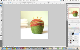
The final image:
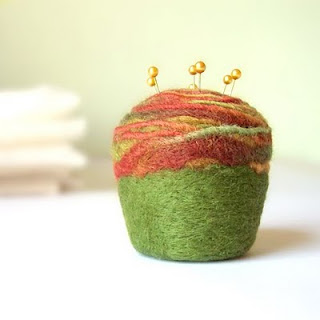
Play around with the different adjustment layers and see what they do. There are endless possibilities. Let me know if you have any questions or if something is not clear... like I said, there is no right or wrong way to do this... just personal preferences. I find that masks and adjustment layers have been an improvement in my processes.

Tuesday, July 13, 2010

Completed Painting: High and Dry

5 by 7 on cradle board... or whatever you call it (I'm such a professional!)

Another photo from the Rookie Painter website (past challenge). Once again... glass is HARD!


I do love my palette afterwards :)

Tuesday, June 29, 2010

Creative Habit: Day 7/8

Before we get into actual paintings... I opened a Big Cartel shop HERE. I'm trying to take the next step and take control of my own shop and see how it goes. My Etsy Shop is still active and in effect, but I am trying out this other one for now as well... I'd love your feedback on it.

The past 2 days haven't really been anything of a habit, but more of a marathon painting session. Tim is away on a business trip so I have less of a tendency to walk away from my easel. I think the creative habit is still working though. Immersing myself in books about art and artists and creative people... as well as talking with and looking up to other artists is a good step towards where I want to be. I do, however, want to really get a "habit" going.

Yesterday I finished 2 paintings... in the same day. This might be a christmas miracle.


Tuesday, June 15, 2010

Creative Habit: Day 2

OK not exactly what I planned in terms of the creative habit, but yes... I got painting done. It was a slow start. I did the steps... but in a slow format. And I checked my email before I started which delayed my start like an hour.

DISTRACTIONS ARE BAD!!! Painted, then checked email and internets... painted, then got some snacks. The usual.... BUT I did get some stuff done.

1. I finished the small glass of scotch which was originally only supposed to take one session.


2. I put drawings down on 2 more canvases... one 12 by 12 and one 24 y 24 (woah thats big!). I know I have like 4 or 5 still unfinished but I'm not inspired by those at the moment. Stapler product shot courtesy of SugarPush


3. I made progress on 2 smaller 3 trees paintings (8 by 8 and 5 by 5) both very colorful.


All in all a productive day I guess.

Wednesday, June 09, 2010

Completed Painting: Drunk on the Train to Chicago

At 11:00 PM I decide to make more progress on this painting. I am a night owl. I get more painting done at night. there are times that I think I should just sleep during the day and that way I'd get more painting done.... but I'm sure my day-job would not be happy about that. So when I should have been getting ready for bed, I just taped off the border:
Here it is after I take off the tape. Like I thought, I had to use thick white paint in order for it not to creep under the painters tape. That was a pain in the ass.


Once I cleaned up the edges (there's always SOME seepage) I let that dry overnight. This morning came, and I could see the light at the end of the tunnel. Usually when I end with highlights and/or line elements, I get that feeling of relief that comes with knowing only one more session is needed. Sometimes I am stupid, and I do highlights and line elements mid-process. (No one ever said my process was a good one!)

And voila! After a little drop-shadow work and touching up the white border, we have a completed painting:


I do plan on have a couple prints made for people who have already requested them (entire image including the linen border). If you are interested in purchasing a print of this as well, please contact me to pre-order. ioLabs also offers the option to print on wood or aluminum which might be super cool (for wood or aluminum it would not include the linen border, just the image... so you'd have a wood grain border, or an aluminum border instead of the linen) .

I am doing only one run of these and if you don't have an order in before I go have them made, you snooze you lose. Or you could just buy the original which will be in my Etsy shop but will be significantly more expensive than a print.

Email: art@juliebcreative.com by the end of next week if interested. Thanks!

Monday, May 17, 2010

Hmmm

When I paint, I have 2 rags that I use to wipe off my brushes and palette knives. The two I have been using for about 2 years now are:

#1. A dish towel from my great grandmother. My grandmother doesn't like to let things go to waste so when my great grandmother passed away, she sent me her dish towels. Being the sentimental sap that I am, I wanted to keep them but didn't really have a need for more dish towels. So I put it to good use, in that it's always around me when I'm doing what I love and keeps her at my side.

#2. A tank top that I wore on the day I made the Roller Derby team in RI after 3 months of playing... which is also the day I broke my ankle and had to quit roller derby. I had written in Sharpie marker my derby name (Dee Vine Proportions) and my number (the golden ratio).

I put meaning into silly things... and sometimes I allow that internal meaning to guide my decision making. We humans are strange creatures, don't you think?

It's time to retire these two rags... since they're all crusty with dried paint. I can't bring my self to throw them out yet. I think I'll keep them for a little bit longer. I hung them on a couple open nails in my walls and for some reason they looked like they could be a part of some super deep existential gallery exhibit. Don't you think? Maybe I have my new series of painting sitting before my eyes ;)


Sunday, May 09, 2010

Twist

The Twist show was a blazing success. Me and Melissa from Pressbound (who I met on Twitter) drove up to Northampton where we met up with Kristin Crane, HeatherJeany, and Devianna from DAMetals. From there was proceeded to set up our tables and got ready for the onslaught of customers.

Twist is probably one of the most fun shows I've ever done. You are fed, given free drinks, limited to a 6 foot table for products and it is insanely well organized. It is also my second most successful (financially) show of all time, so that's always a good reason to return.

A moment that really solidified my continued participation is when a couple people actually said to me "Oh I was hoping you'd be here again!" It really makes all the hard work worthwhile... to see these paintings make their way into people homes and lives and then the work sticks in their brains. The connections I make with my customers is obviously a personal highlight for me in the business of art.

Thank you to all that came out and kept me smiling the whole time. I'm looking forward to the fall Twist show of this year!


Thursday, April 29, 2010

Painting in Progress: Drunk on the Train to Chicago

I originally took this reference photo for a commissioned piece, but before I even started it the guy changed his mind and bought the Mason Jar painting from a couple months back. I liked the reference photo I took so I was holding onto it in my "Folder Of Things I may Paint One Day."

This painting is unique in that I am trying a different type of canvas. This is a linen canvas, which isn't unique, but it's a linen canvas with clear gesso. The darker background will force me to adjust colors here and there, but right off the bat, this canvas is a GIANT PAIN IN THE ASS. Remind me not use this type of canvas anymore. The acrylic paint does not like the bare surface, so technically I'm going to have to do double the work that I normally would. It's rough and is soaking up the acrylics like nobody's business.

Either way, once it's done I'm sure it'll be sharp (I'm leaving an inch of clean canvas on the edges and then will be masking in a pure white border around the image.

Also, the title... another homage to Mike Doughty and his beautiful lyrics... but ironically I went to visit my friend in Chicago a while back. And we got drunk. And went on the train. And it was fun.

After one session:

Monday, April 26, 2010

Painting in Progress: My Circus Train Pulls Through the Night

My circus train pulls through the night, Full of lions and trapeze artists..." - Lyrics by Mike Doughty from "American Car"

The inspiration behind this painting is the book Water for Elephants. It's a beautiful book and the pocket-watch is a small but significant icon in the story about a tag-along on a depression era traveling circus train.

The watch itself was pretty hard to paint. I started this before we moved but the greys/greens/blues are all very deceiving. The edges of the painting have made quite a few journeys... first grey, then white, then green... and are now red because I decided that I wanted to do the edges similar to the spine of the book which has a red and black stripe pattern (as shown below).

I think it will be cool once the edges are done!


Friday, April 23, 2010

Completed painting: Cash Cow

Milk! It does a body good. But whites and neutrals do not do a body good because they're a pain in the ass to paint. Happily though, I finished this in one sitting. Why? Because the one thing I got out of my maritime painting class was to MIX UP THE MAIN COLORS AHEAD OF TIME.